Modern Open Concept Home
An Open Concept First Floor Home Remodel With A Fresh, Modern Look
The Story
Client Goals
Our clients loved their home, but were tired of the inefficient first floor.
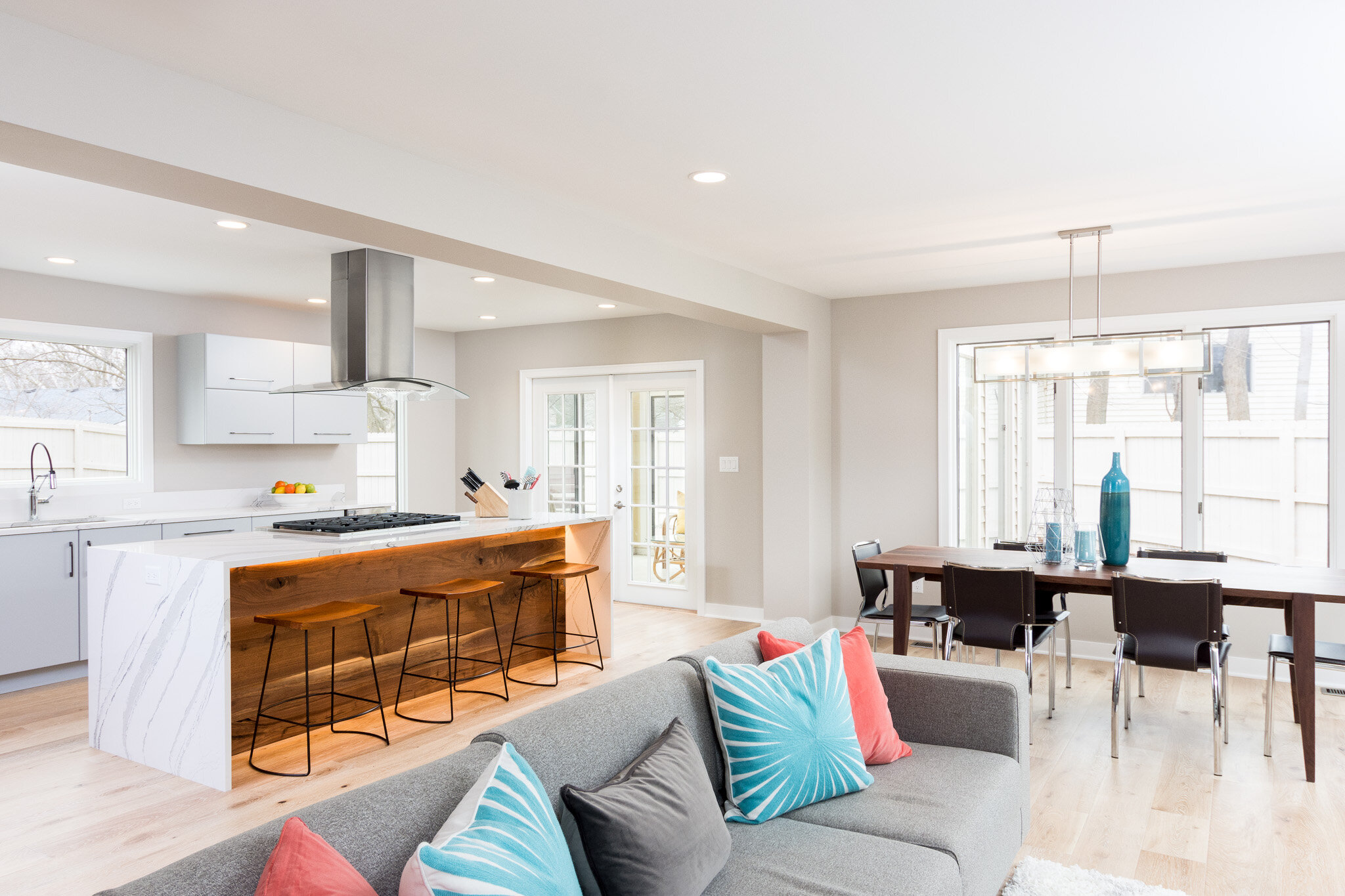
The goal was to create an open concept floor plan that improved the flow, and made entertaining easier.
They wanted to enlarge a small kitchen and open the space into the living area, and create a modern and fun space.
The Existing Conditions
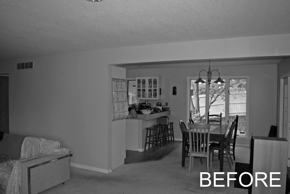
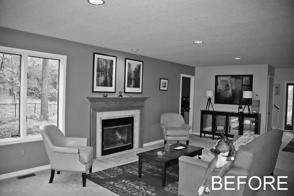
At first glance, the floor plan seems to work pretty well. However, once our clients lived in the house for a while, they discovered that the spaces were not well organized.
The living room was hard to seat and felt very small.
The kitchen had nice counter top space, but also had a main circulation route running right thru the work triangle.
Our challenge was to re-organize the space to utilize the sqaure footage in the best way possible.
The Plan
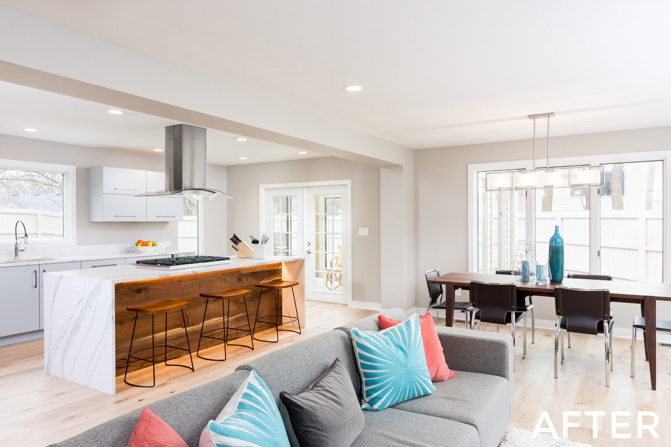
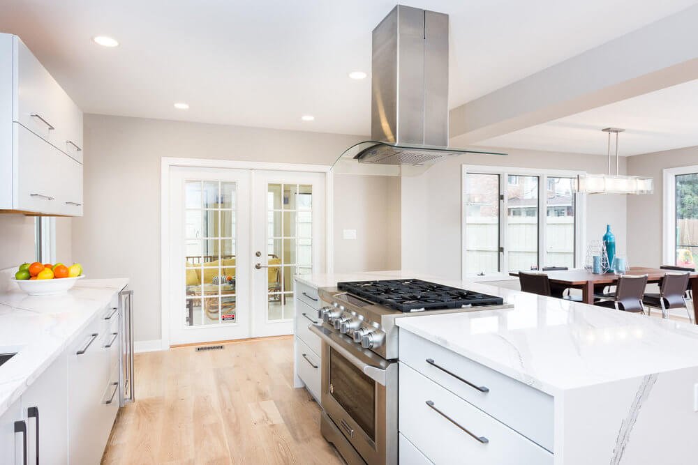
Our first task was to eliminate a section of a structural wall between the kitchen and living room. This allowed us to elongate the kitchen.
A kitchen island island was centralized between the living room and the dining space was relocated.
We relocated the dining room to provide balance to the living room and maintain a formal feel.
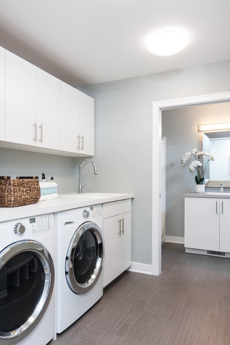
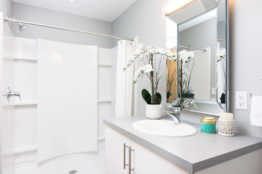
We also redesigned the garage entry to include a new mudroom, and a more efficient bathroom layout.
A Rendering Tells the Story
Putting together the interior pallet is all about placement - and a rendering is the best way to illustrate the power of these simple materials. A strong walnut wood is the consistent detail in the home, and it is used as an accent against the white background.
The Finishes
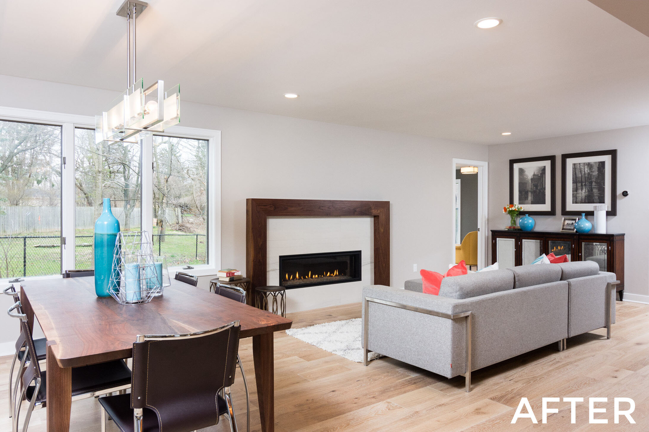
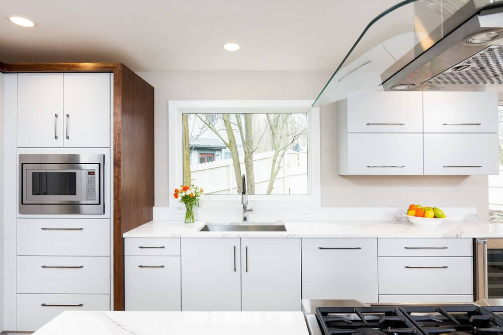
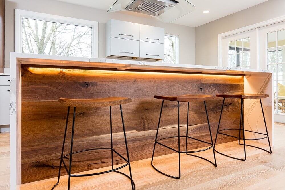
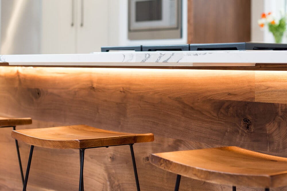
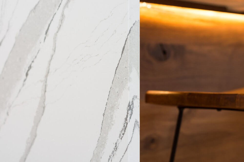
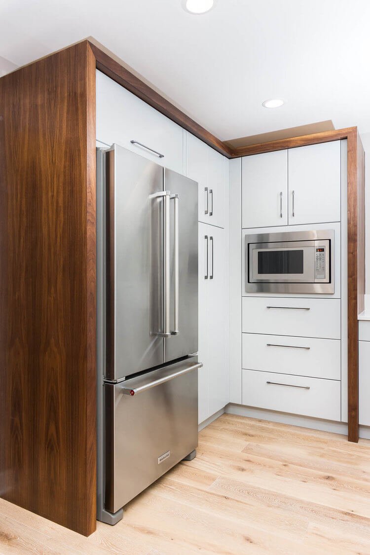
Wood materials were used to bring warmth and elegance to the space. These can be seen in the custom walnut wrapped pantry corner, and a reclaimed walnut island front, which is framed by a quartz waterfall-edge counter. The floors are a wide plank white washed oak floor. All of the interior finishes were updated for a cohesive contemporary look.
Modest Fireplace
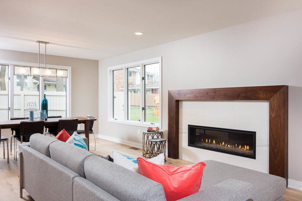
To help anchor the wide open living room, we utilize a simple walnut frame around a soft white tile surround.
The Result
We strove to create a contemporary, functional space to match the life style and sensibilities of the homeowners.
The Outcome
“In retrospect, we could not imagine working with any other design/build team. I felt like it was a true partnership every step of the way. The firm has VERY high standards of quality which showed through not only in project design and execution, but also in their communication and on-time performance. They were great about hearing and acting on feedback Jef’s got a super talented crew and we felt fortunate to be able to work with Ann Marie Clark (design) and Tim Frincke (lead carpenter). The carpenters were super friendly and professional and after four months were even a little sad to see them go! As we look around the house today, we’re still awed at the fit and finish; there are simply no mistakes to be found in the craftsmanship. Going into the project, we were told that Forward Design Build is on the high end price-wise, but it’s a case of getting what you pay for. If you have high standards of quality and discerning taste with expectations that promises made are promises kept, you have to go with Forward Design Build.”

