Modern Kitchen and Interior Remodel
Reconfiguring a Kitchen and Mudroom in Ann Arbor, Michigan
The Story
Client Goals
Our clients came to us wanting a total refresh of their first floor common areas.
They wanted a new and modern aesthetic carried through from the mudroom to the kitchen to the living room.
Although the overall layout of these spaces worked pretty well, the materials felt outdated and there were a few pinch points to work out.
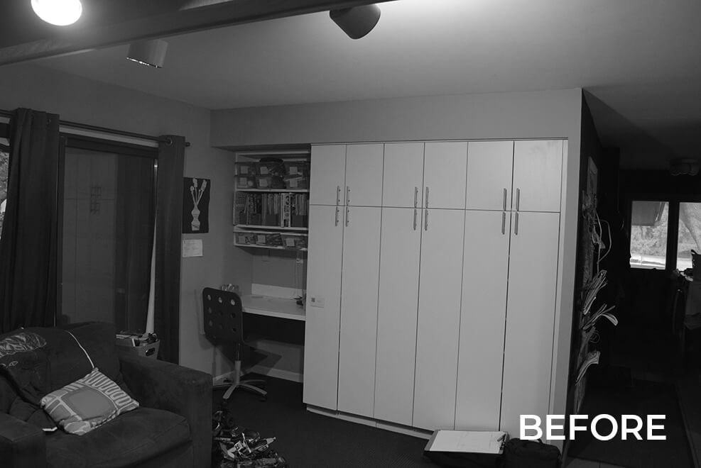
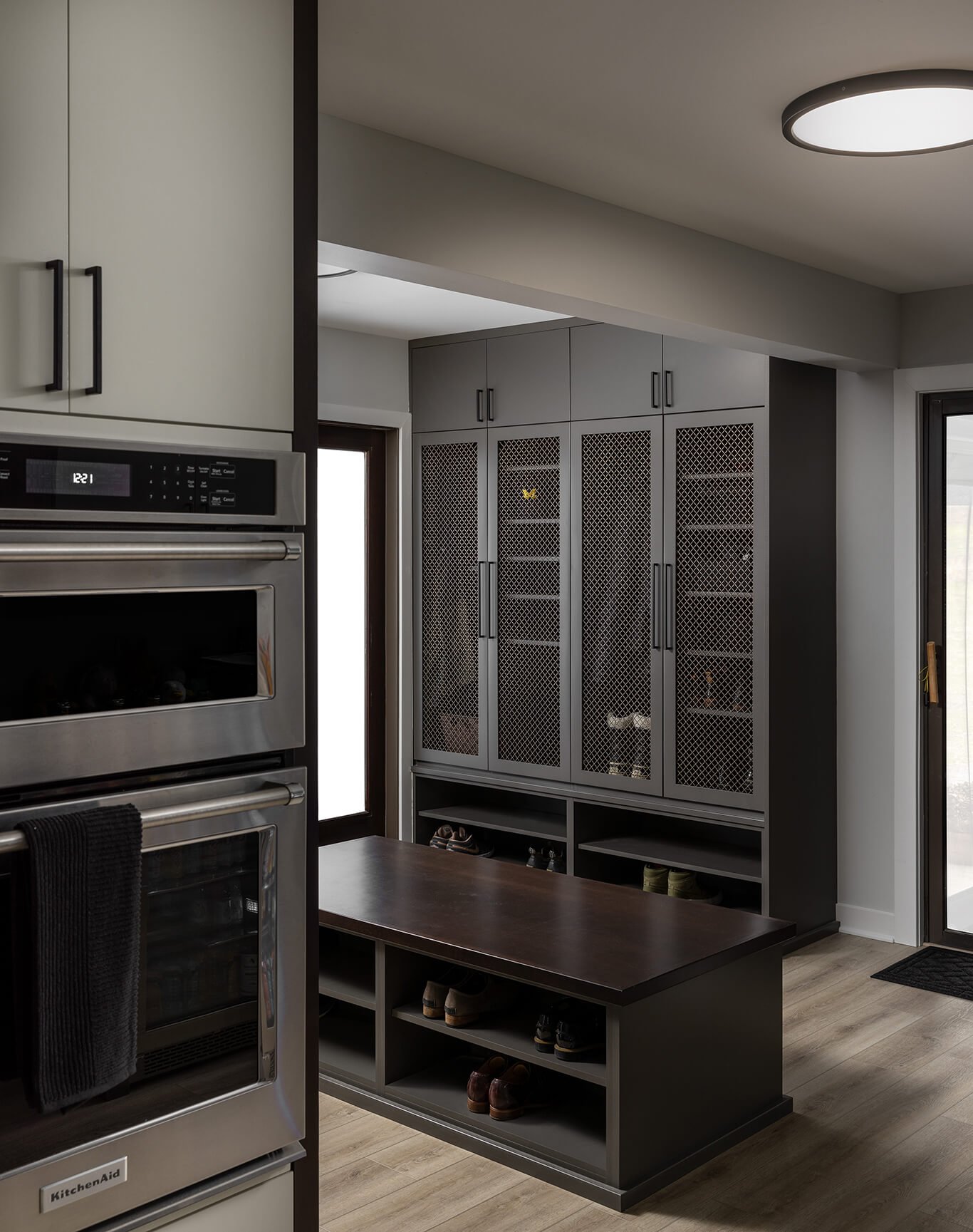
Another key goal was to create a large mudroom with a locker room feel to accommodate a family involved in many sports.
The Existing Conditions
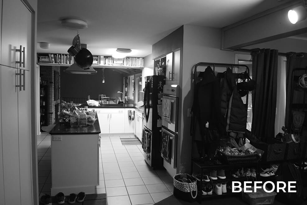
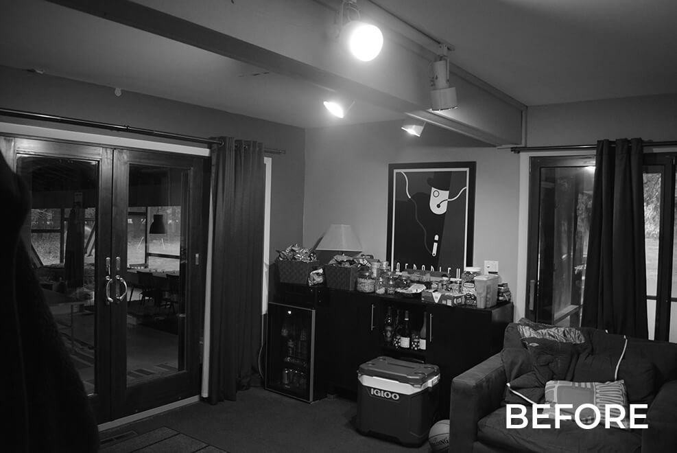
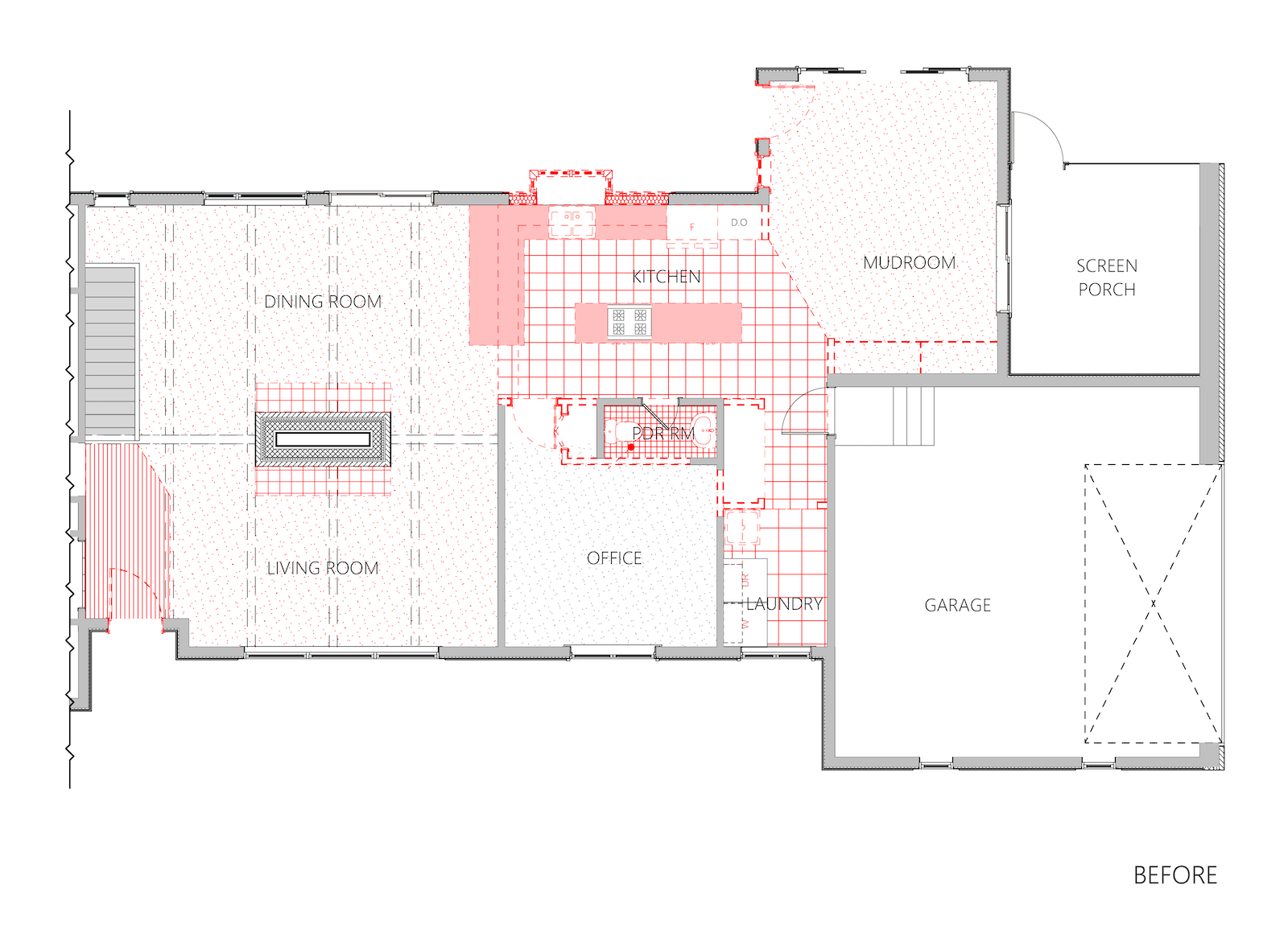
The existing plan presented a pinch point for the day to day entry from the garage into the kitchen and lacked a true mudroom with sufficient, organized storage. Also, guests using the office and powder room had to enter through the kitchen, lacking privacy in the mornings. Lastly, the color scheme and materials throughout the first floor felt very dark and outdated.
The Plan
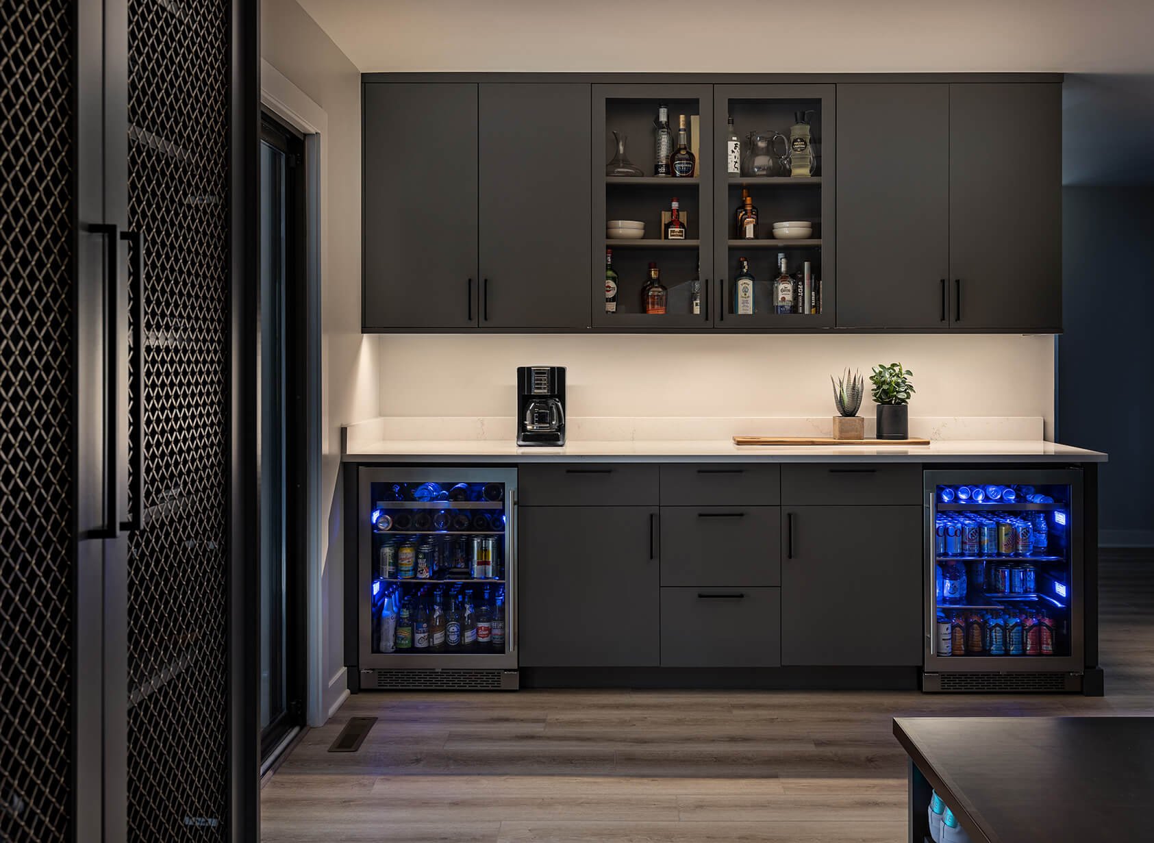
Our design aimed to address the overall aesthetics but also specifically bring more light into the kitchen, provide a true kitchen pantry, plan for a dedicated entertainment counter, and create a large formal mudroom with ample, organized storage.
The Soffit Struggle
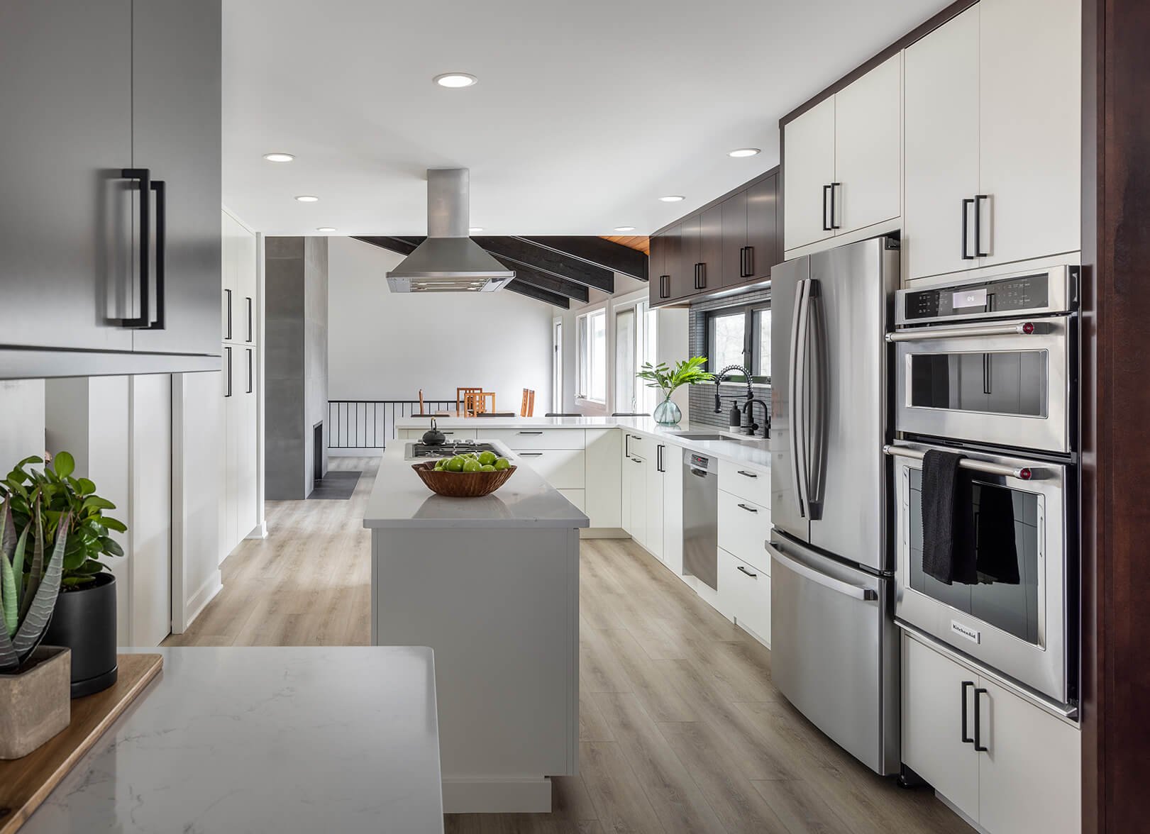
A major strategy to physically and mentally bring more light into the kitchen was to remove the kitchen soffits, introduce can lighting, and add a much wider window above the sink.
By bringing cabinets to the ceiling and adding more light, the kitchen feels taller and brighter.
Fireplace Update
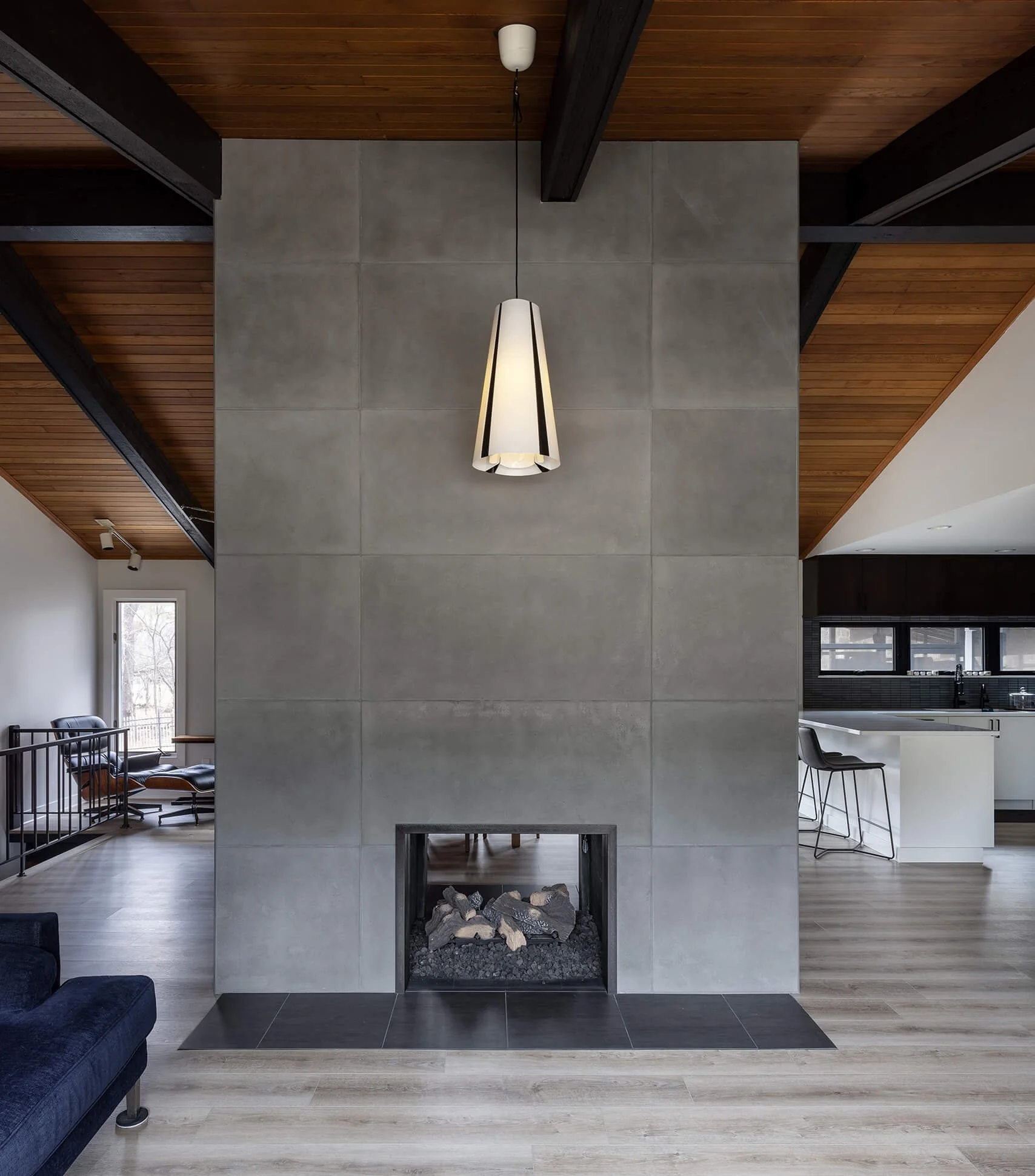
For a more modern and minimal look, a faux-concrete panel was used to clad the existing fireplace.
Kitchen Window
Expanding the views into the backyard entertainment space was also important for our client.
Planning for a large horizontal backsplash window had its challenges - such as finding the right height for viewing while maintaining a functional height of the cabinets above.
To emphasize a minimal and modern look, we tiled around the opening right up to the window sash, eliminating additional trim around the window.

