Behind the Scenes of our Cohesive Mid-Century Modern Remodel
Telling the Remodeling Story of an Interior Remodel in Ann Arbor, MI
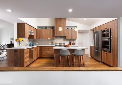
Final Photography
Want to take a deeper look at the design build process for this mid-century modern interior remodel? We go behind the scenes for each stage of the design and construction phases for you to have a full understanding of what the process involves.
Client Goals
Our clients came to us with specific remodeling goals to create a more functional home with updated finishes and expanded views of the lovely Huron River, which is right outside their backyard. Living in a mid-century modern home that had been reconfigured and added onto twice in the 80s caused some odd spatial obstacles that our clients wished to resolve.
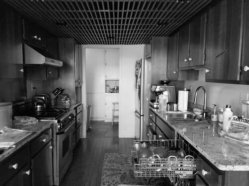
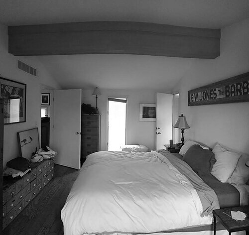
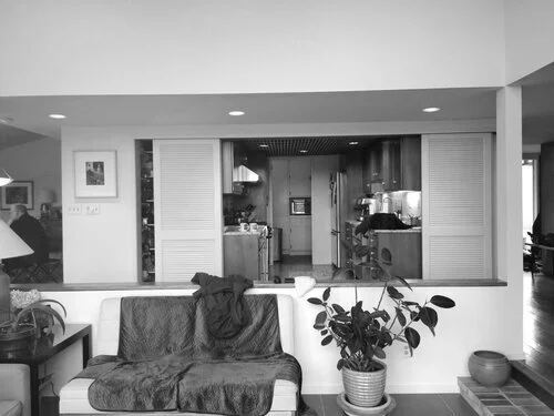
One unappealing element for our clients was that the path from the garage to the main living space was directly through their master bedroom. There was also a redundant maze of separate closets and his & her bathrooms that took up excess square footage. Another pain for our clients was the dark, small, and outdated kitchen. Lastly, on the north side of their home, the large family room was not being utilized to its full potential. All in all, their home is in a great location with amazing views but the circulation and floor plan needed to be reconfigured into one cohesive design solution that offers more function and flow from one space to the next.
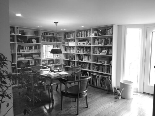
Before Photos
The Existing Conditions
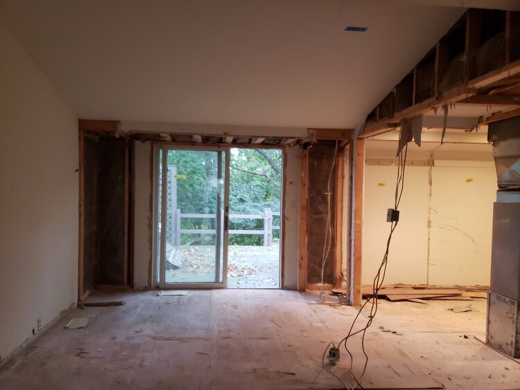
Having a well developed appreciation for art, the homeowners of this lovely blufftop home felt there was something constraining about the views from their house overlooking the Huron River. The views from the deck are spectacular and they wanted to find a way to carry that into the home so they could enjoy the views in the winter months.
Amy and Jose had purchased the mid-century modern home from their parents estate so they were familiar with the 2 additions from the 1980’s. Additions which created a warren of small odd spaces in the Master closet area and the only passage to the garage which runs through the Master bedroom. They finally decided after moving in to take advantage of the remarkable site by opening up the views to the river below.
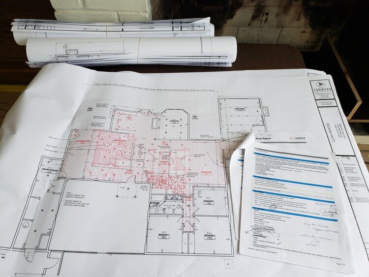
The Plan
Our challenge was to organize our client’s living spaces in a configuration that made more sense for their daily life and for their future as empty-nesters. We approached this project by taking the whole interior layout back to the drawing board. We considered which spaces were efficient for our client’s lifestyle, and which were not.
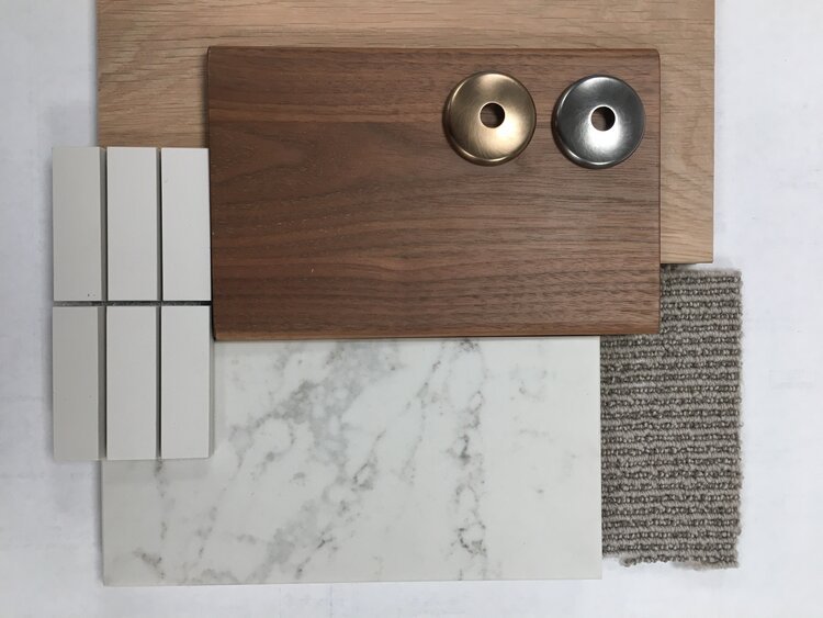
Finishes
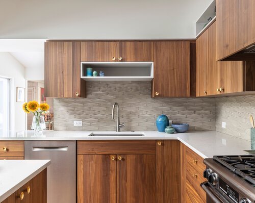
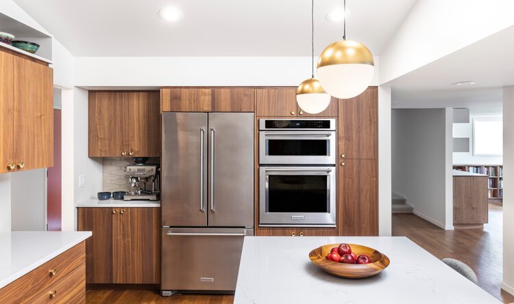
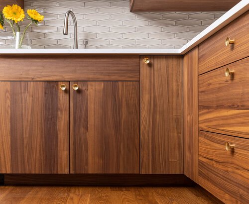
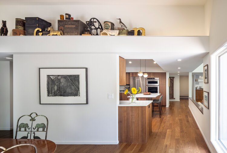
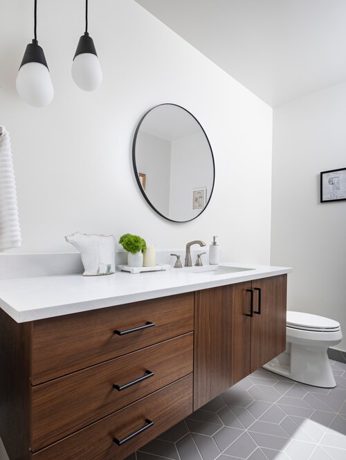
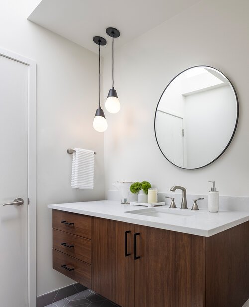
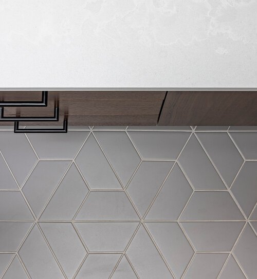
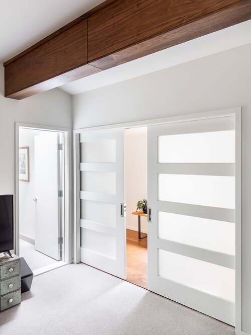
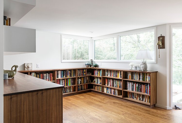
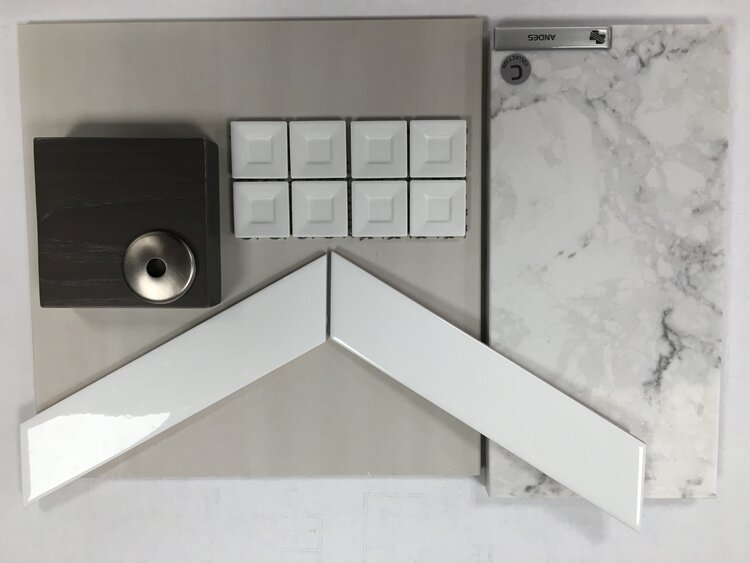
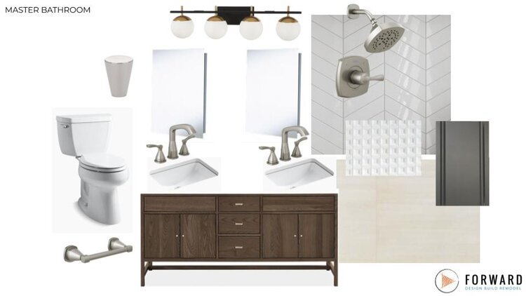
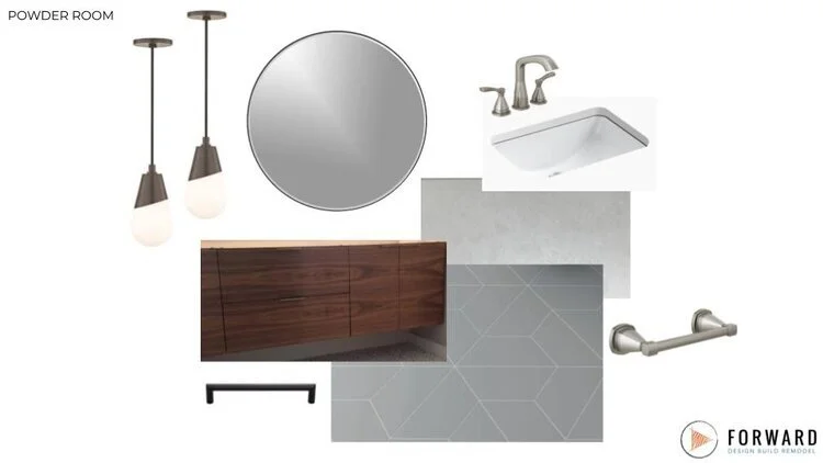
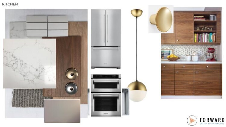
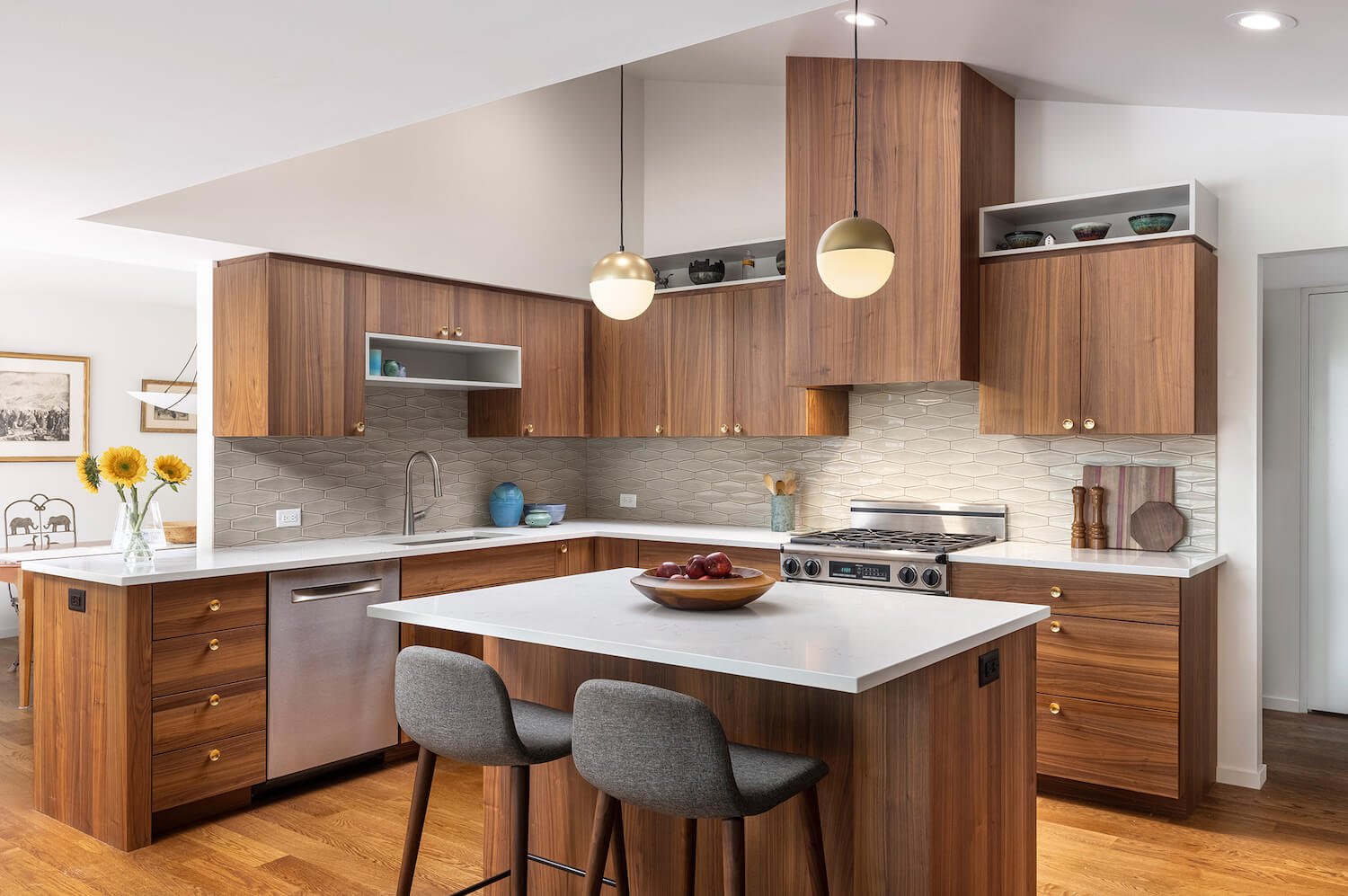
The palette for the project is a mid-century modern look in warm tones. Using a simple geometry with a horizontal influence and natural materials the cabinetry is welcoming and clean-lined while the horizontal oriented backsplash adds a degree of directionality.
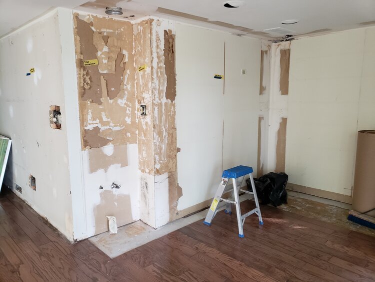
Demolition
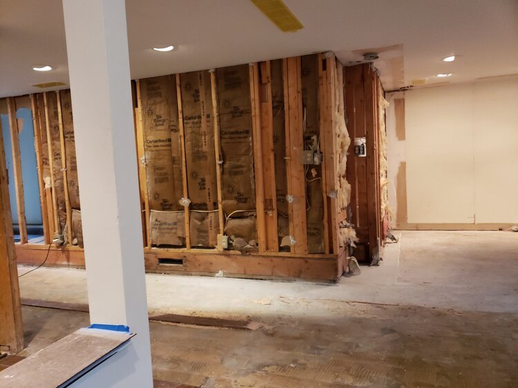
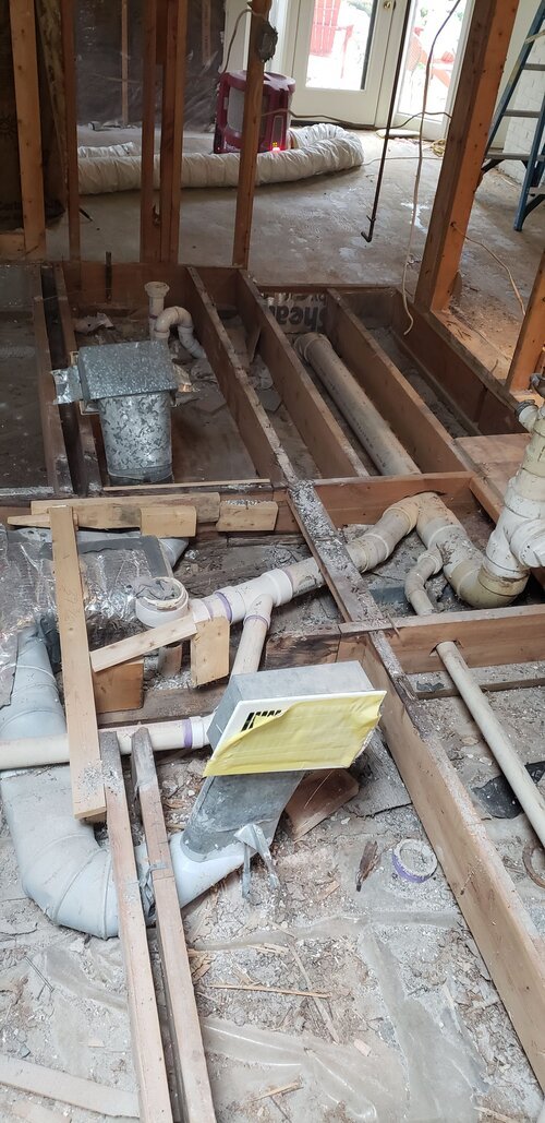
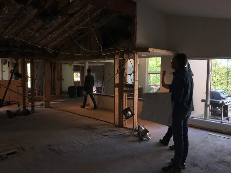
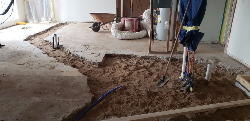
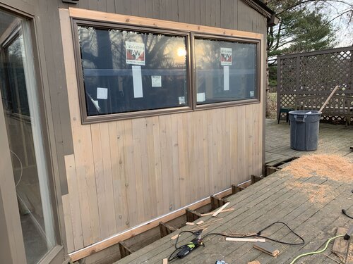
Most of the existing house was constructed with a concrete slab floor on grade under which all of the plumbing and duct work are located. This provides a challenge in locating the water lines and drains that require breaking up the slab.
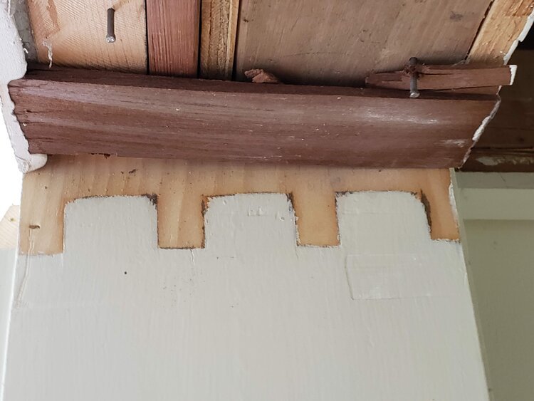
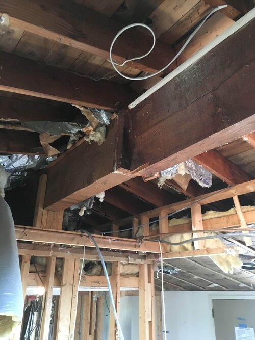
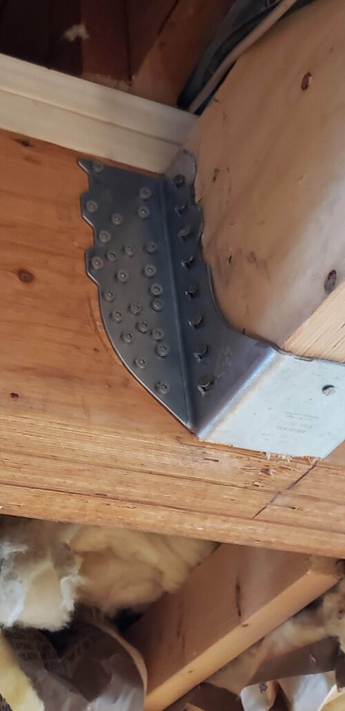
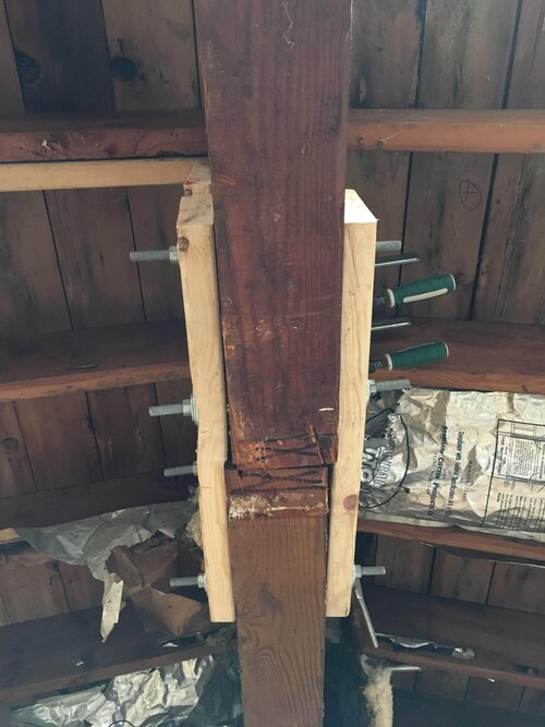
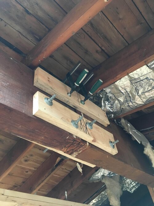
While removing the ceiling in the bathroom, we were surprised to find a support beam floating without proper support. While easily repaired by the crew, the new support will last the life of the house.
Rough Underground Mechanicals
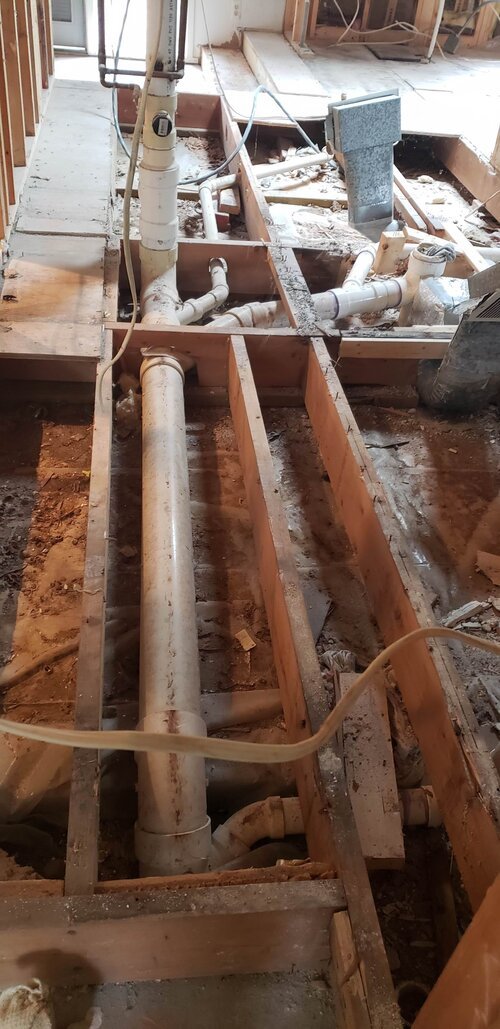
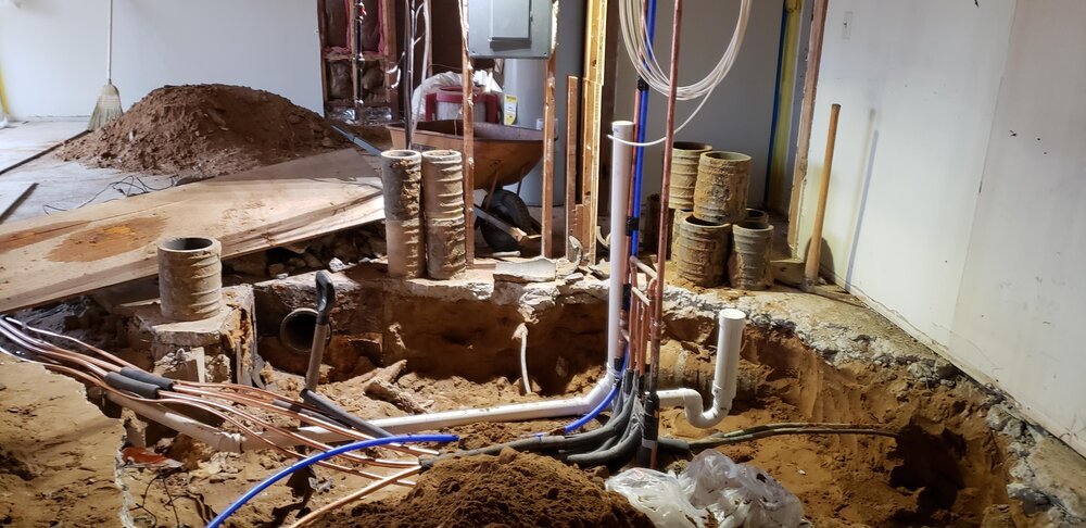
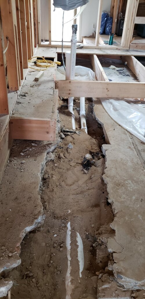
Under slab mechanicals are never easy or fun, unexpected construction methods are always a possibility. In this case old clay pipes are the main material for the drainage. PVC and new duct work replace the old style clay pipes.
The Underground Mechanical Rework
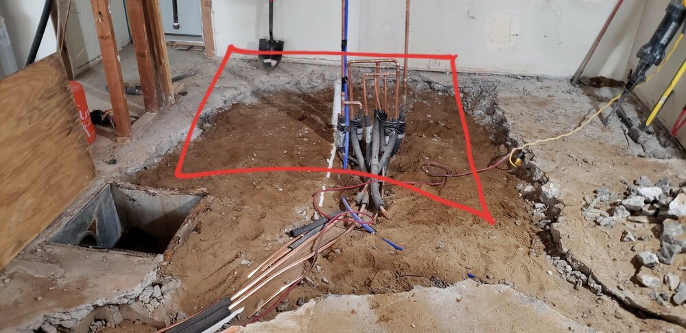
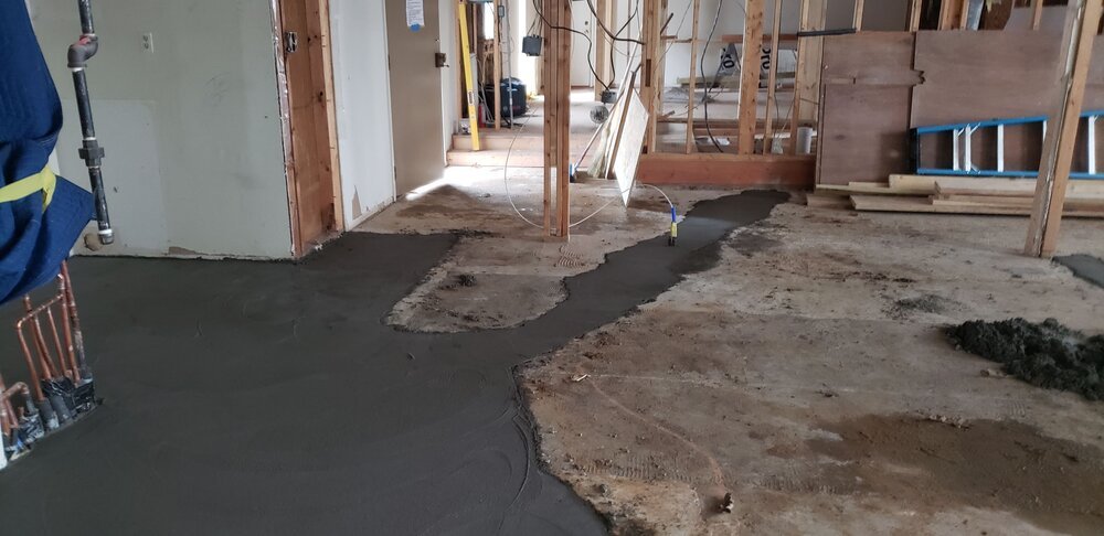
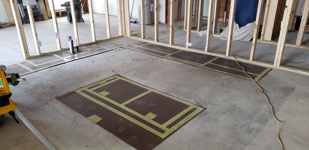
A major part of our work is setting up phase two with the new master suite, which requires extensive trenching with new water lines and drains out to the new master bath location. All the new PVC is in place and up to code standards and we fill in the trench and cover with new concrete.
Framing
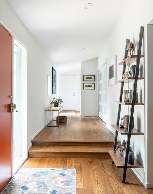
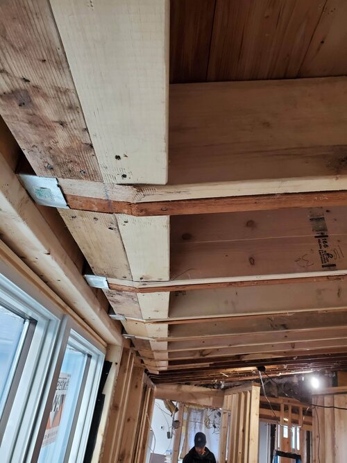
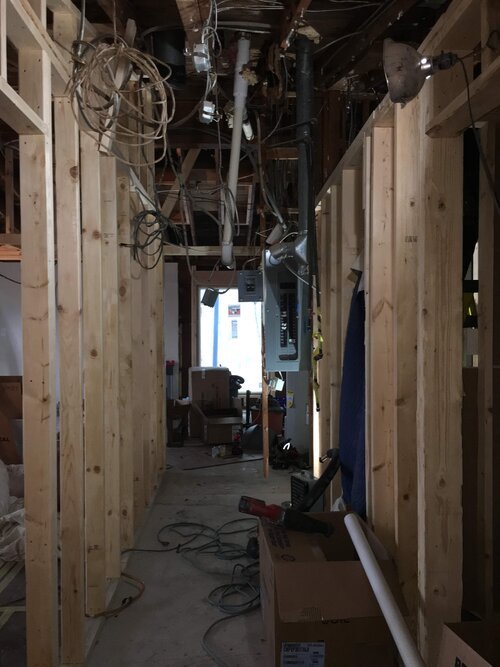
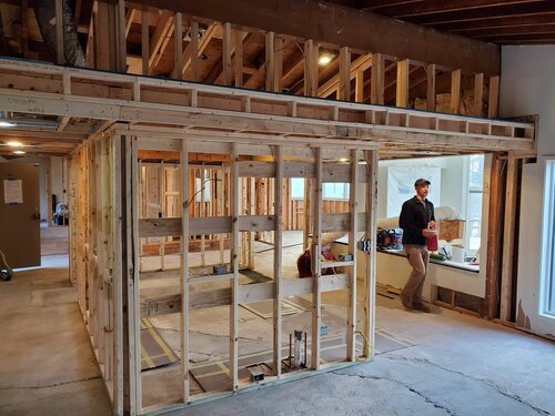
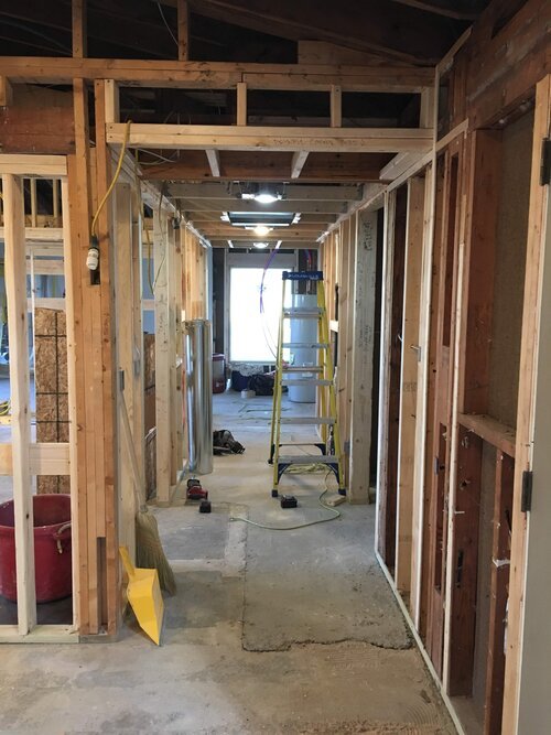
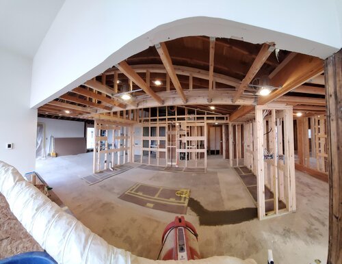
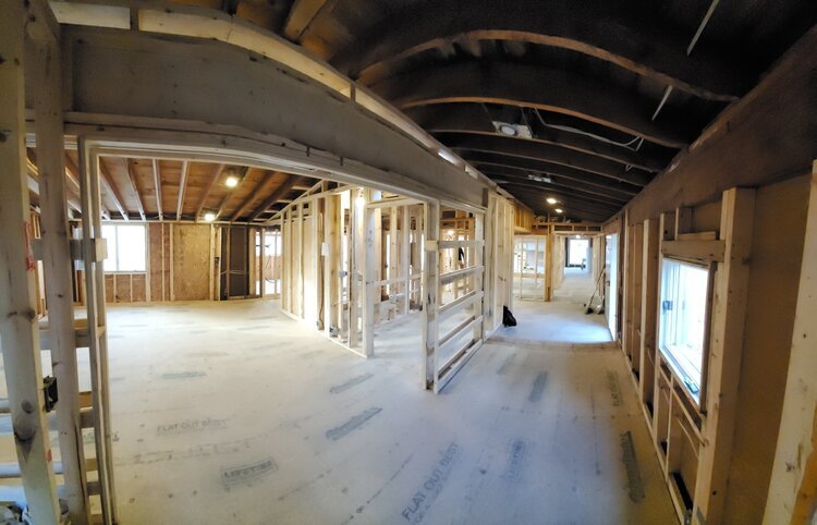
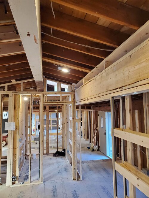
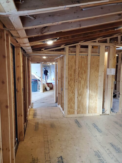
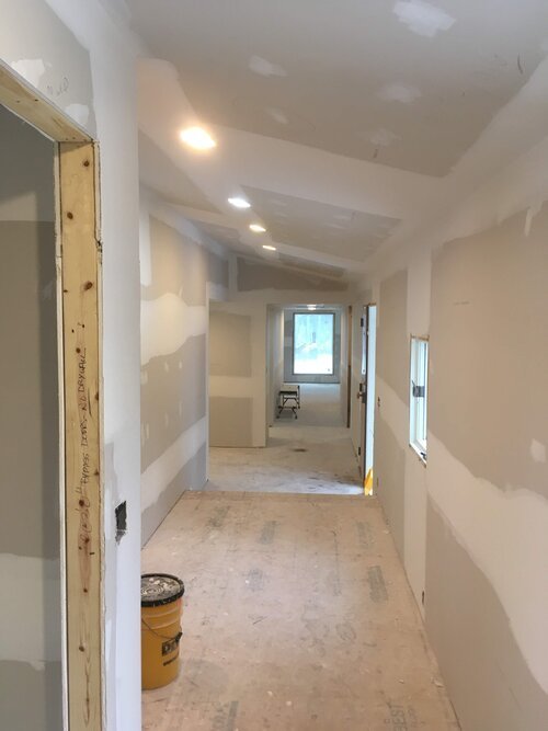
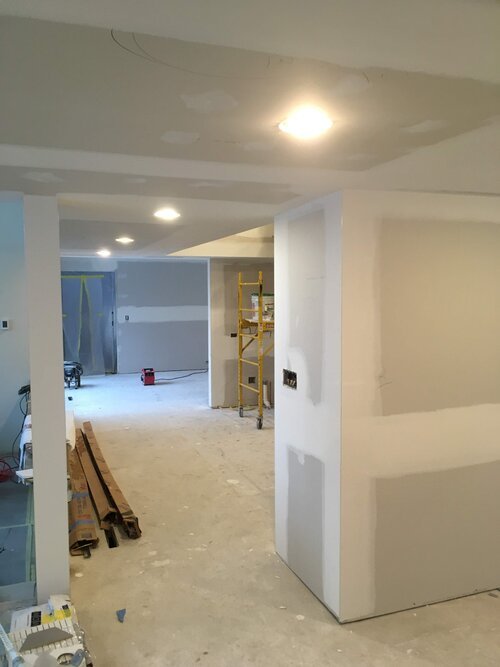
Walls around the new larger kitchen, defining the new powder room, and the mechanical and storage areas all conceal new electrical and mechanical chases. A new wall aligned with the front entry wall defines a gallery leading to the dining room and terminates in a large fixed window that overlooks the north courtyard. The sloped ceiling in the entry now extends all the way to the garage corridor.
Pre-Electrical Wiring
Pre-Insulation
Insulation
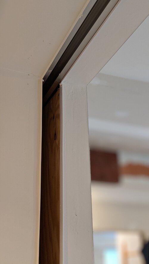
Drywall and Pre-Trim Meeting
The Outcome
“We had a great experience working with Forward Design Build for our extensive remodel. Our project was broad in scope and because of two prior additions and redos posed challenges. We never doubted that Forward had our project under control.” - John & Anne

