Open Concept Kitchen Transformation
Reimagining Space, Light, and Style in Ann Arbor's Georgetown Neighborhood
The Story
Client Goals
In this project, our clients were looking for a kitchen transformation that felt more open and inviting, focusing on improved functionality and style.
Our clients, who love to cook together, found their existing layout lacked space to happily prep and spend time in the kitchen. It also didn’t match their preferred aesthetic.
They needed a brand new layout to improve flow and efficiency, increase storage, add more natural light to the space, and better connect their kitchen to the rest of the home.
The Existing Conditions
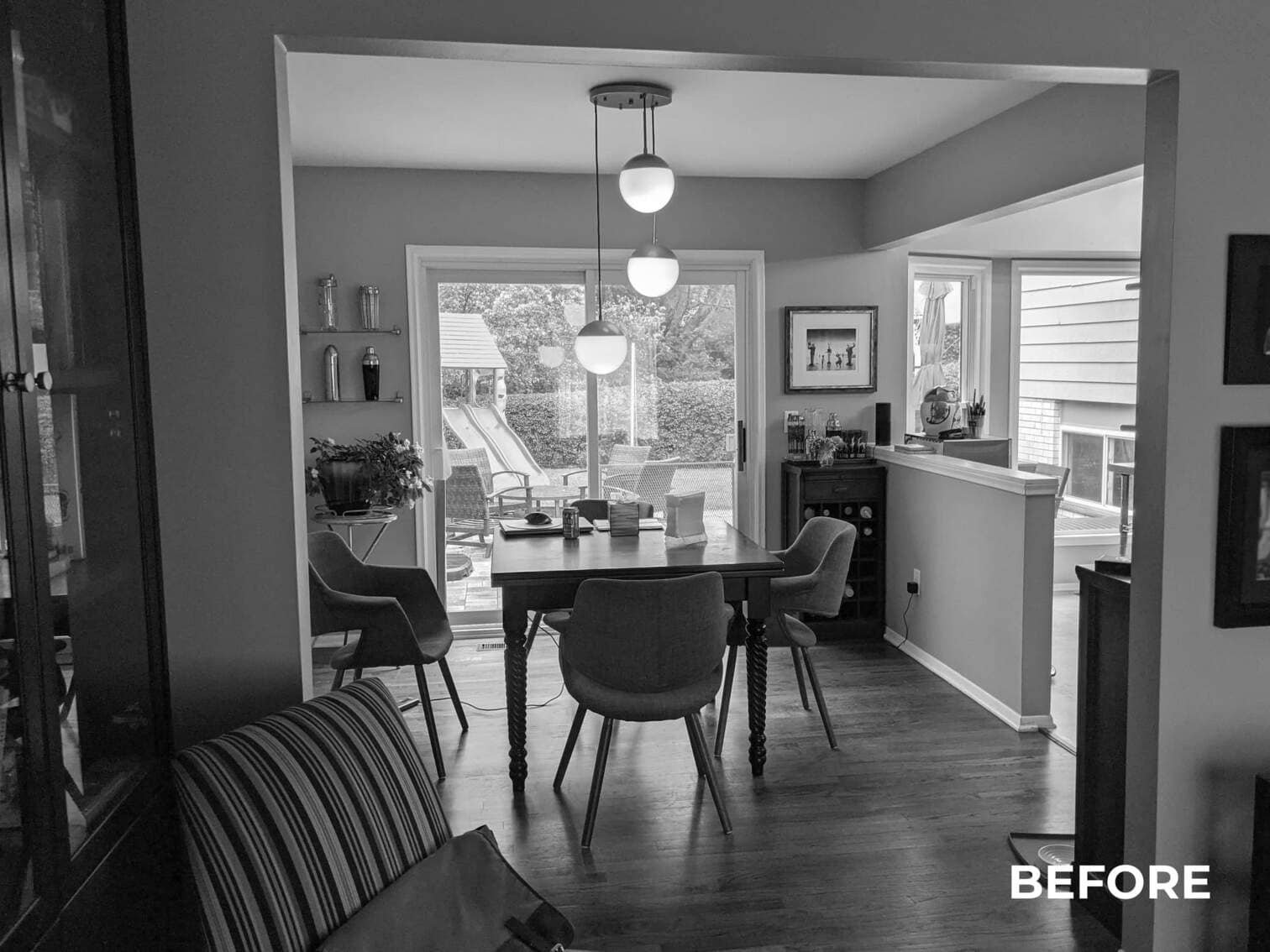
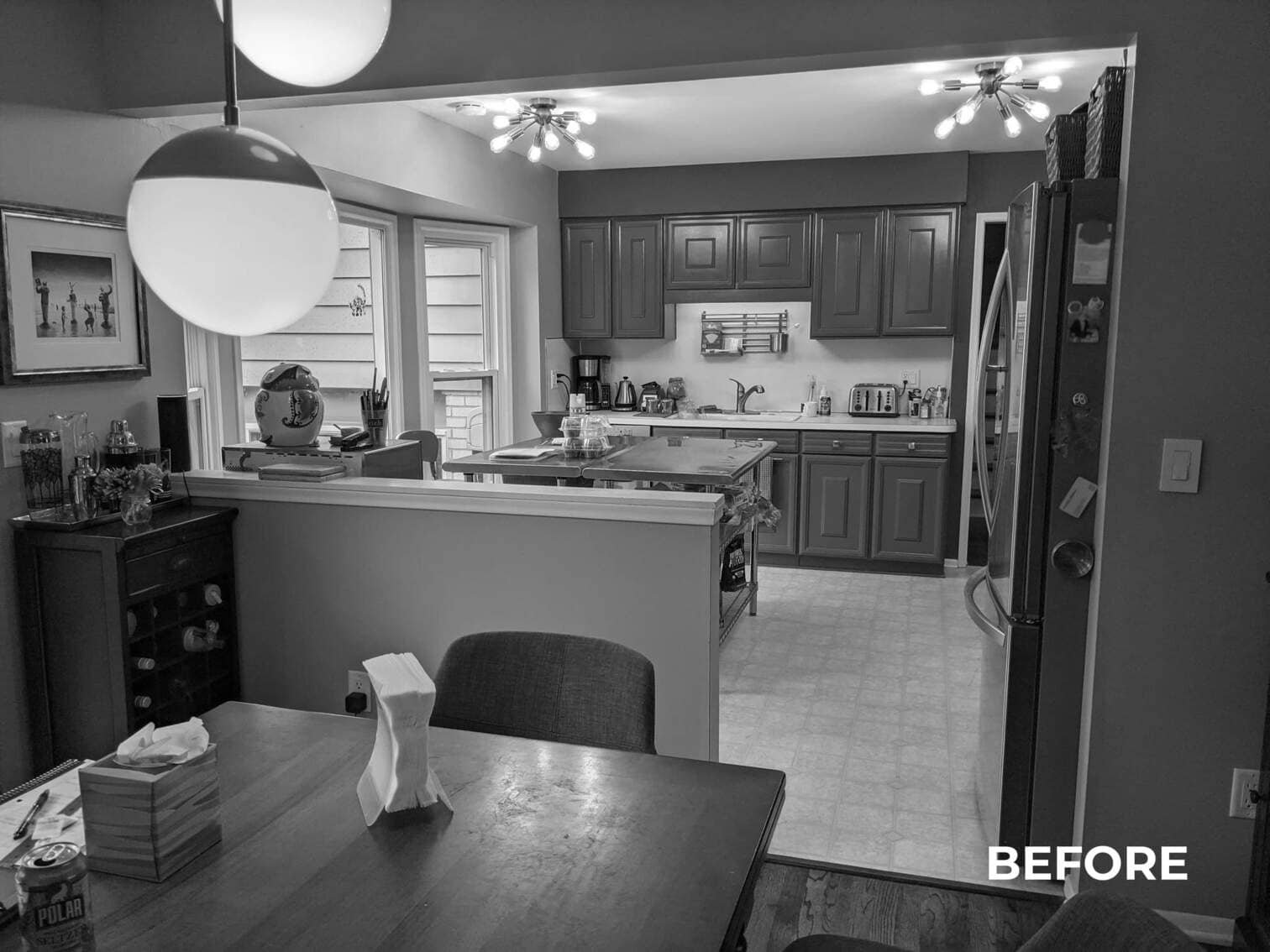
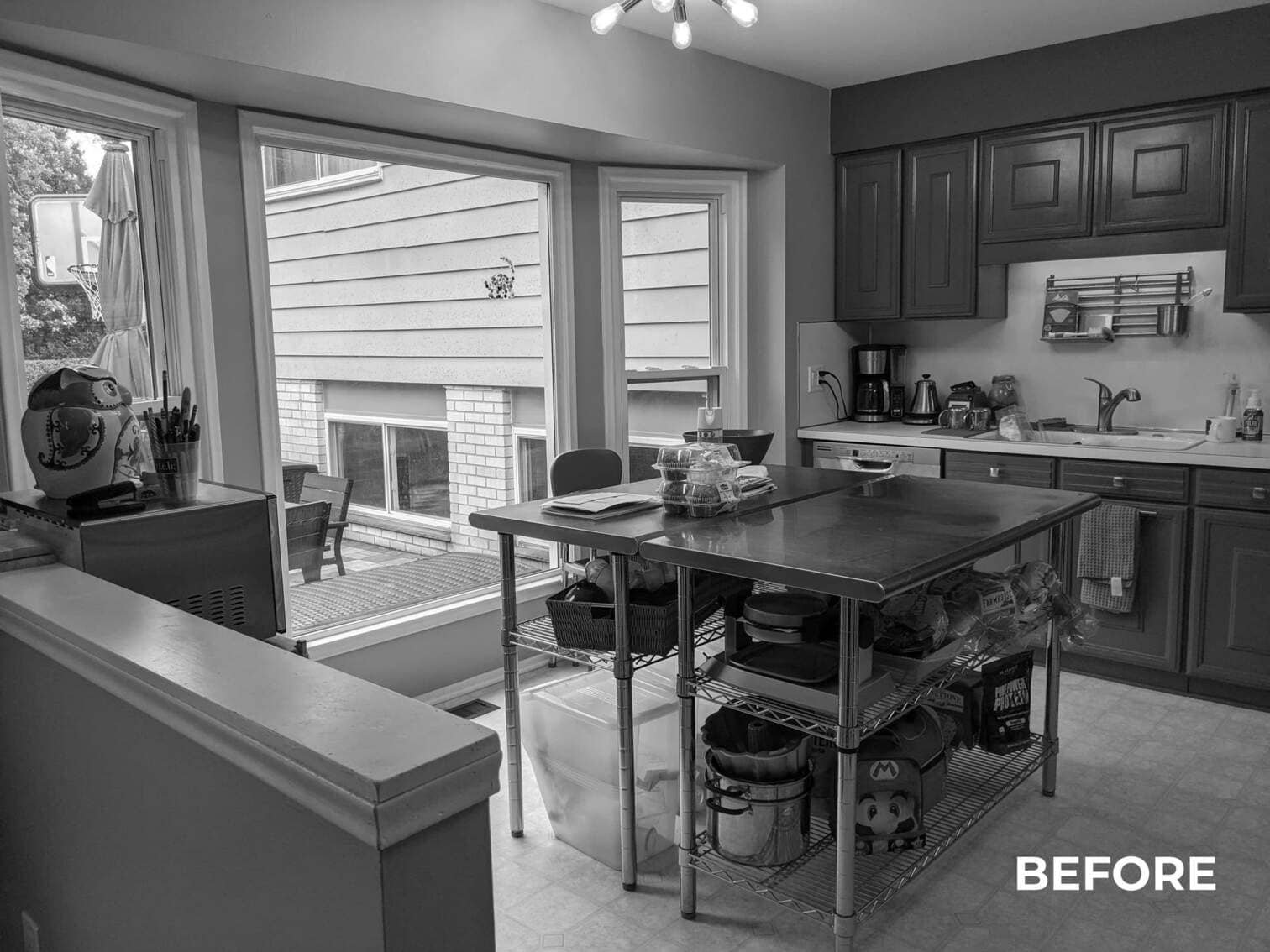
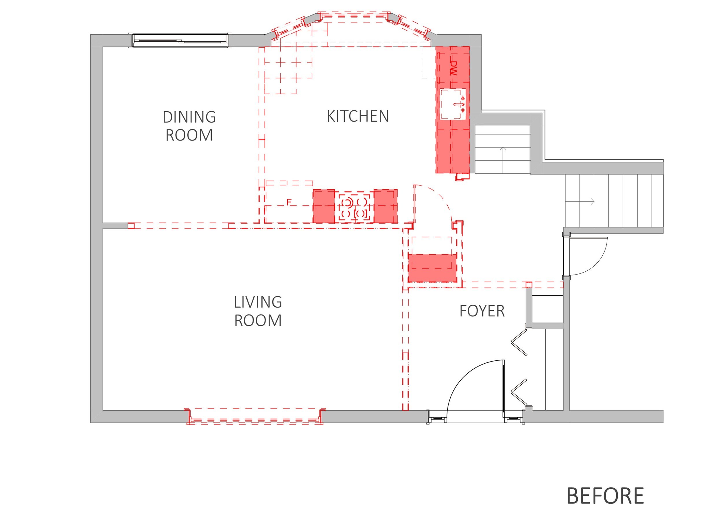
Overall, the existing kitchen layout felt dark and cramped. A wall blocked off most of the family room, and a half wall separated the kitchen from the dining room. The existing layout also had bay windows that went all the way to the floor, which meant lots of space couldn’t be properly utilized.
There were heavy, awkward soffits creating a visual effect that made the space appear even smaller. There was a small pantry with access to the attic, but this access wasn’t useful at all for our clients.
The Plan
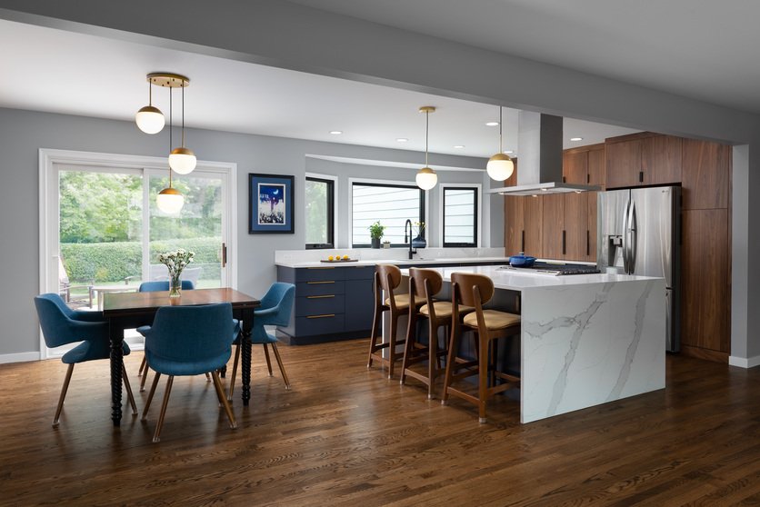
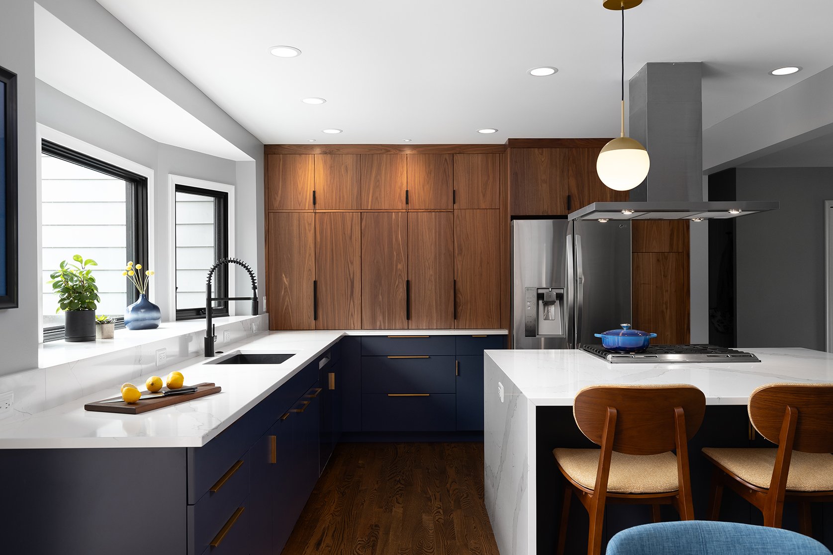
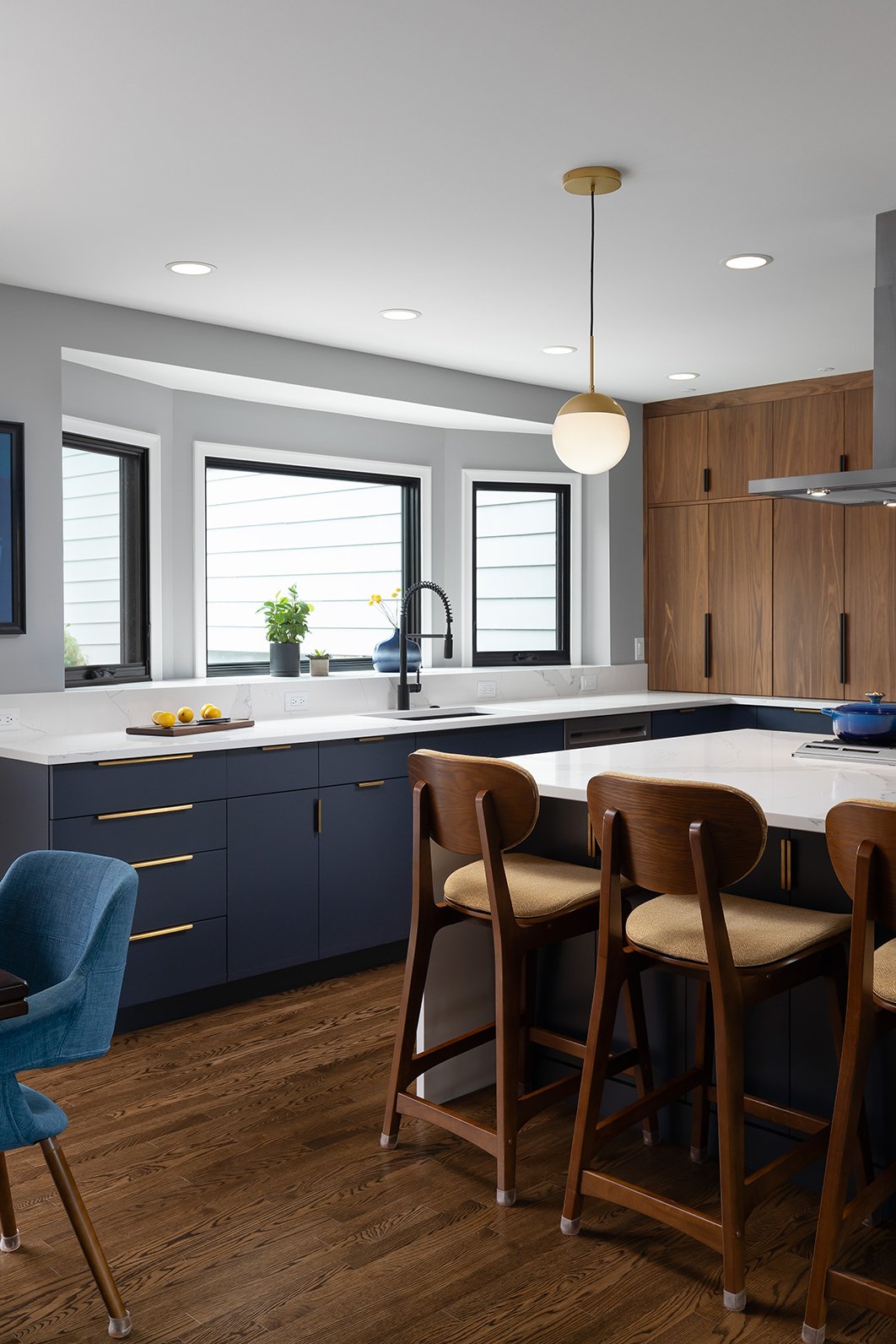
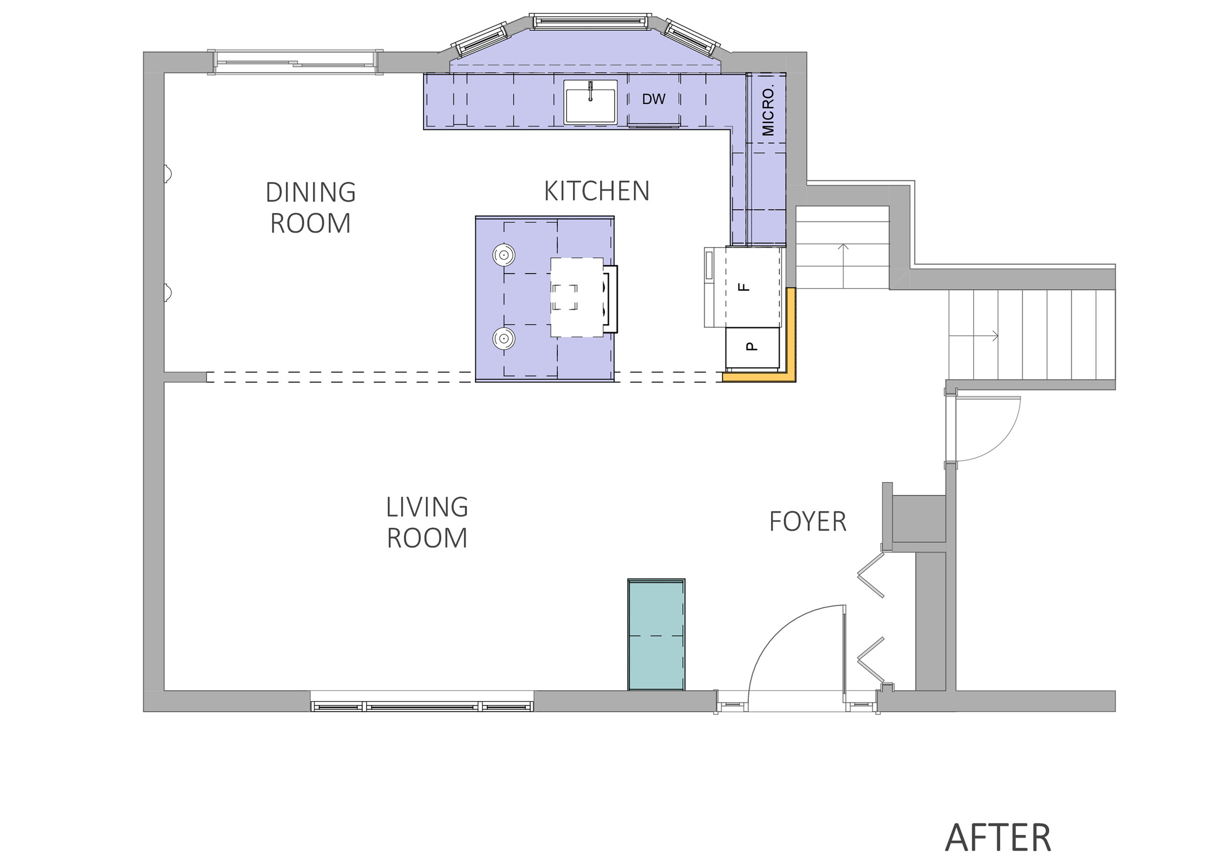
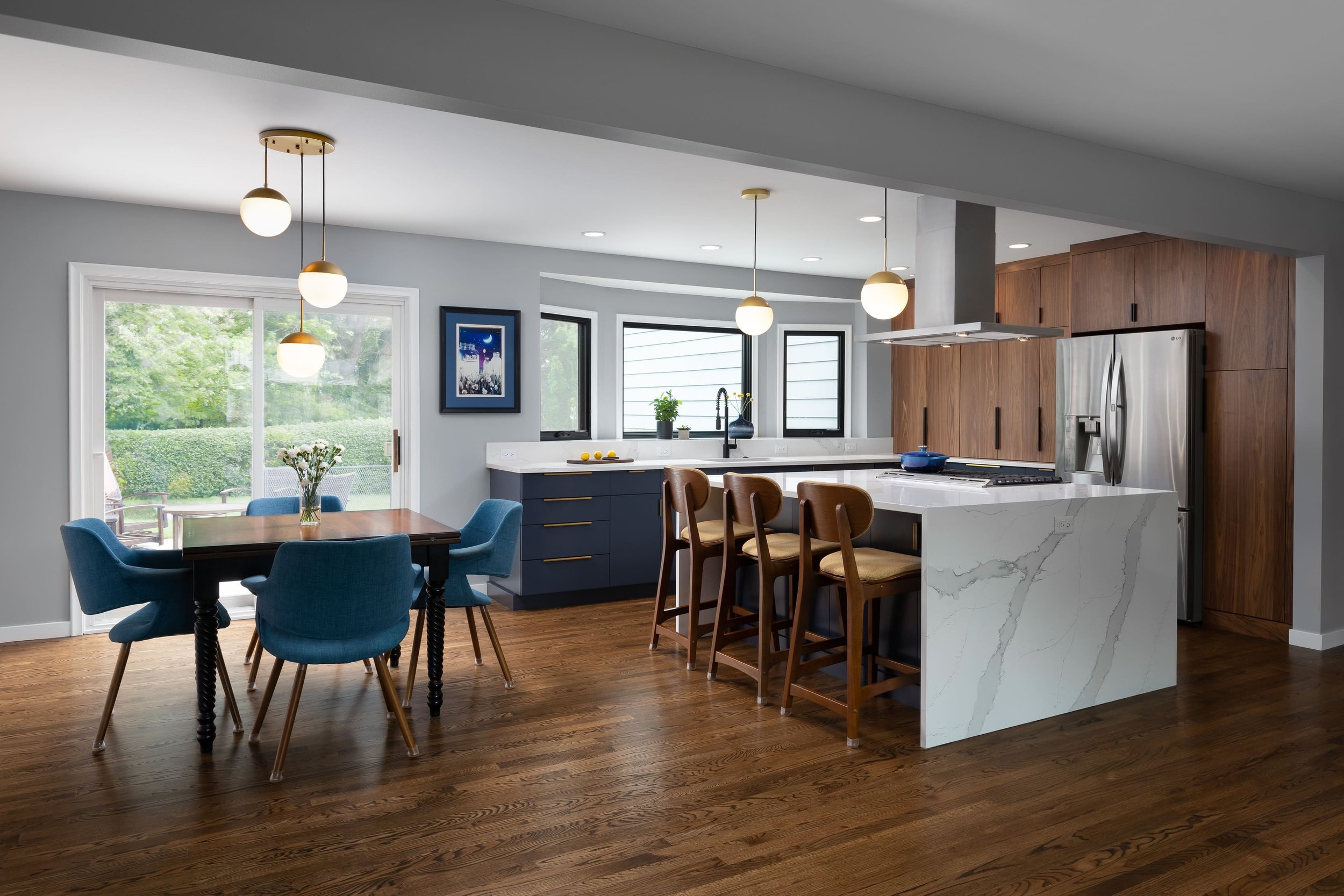
Our design aimed to completely transform the kitchen by embracing an open-concept floor plan. Walls separating the living room, dining room, and foyer were removed, creating a seamless flow. We introduced new windows in the kitchen, strategically raising them to incorporate additional storage and accommodate the kitchen sink, flooding the space with natural light. This redesign significantly expanded both counter and storage space through well-placed perimeter cabinetry.
For the lighting fixtures, we adopted a layered lighting strategy that included both recessed cans and pendant fixtures. We gave the entire space a fresh, modern mid-century look, aligning it with our clients’ distinctive style. Placing the cooktop prominently within the island not only added a visual focal point but also fostered an interactive approach to meal preparation, perfectly suited to our clients' passion for cooking.
Mid-Century with a Modern Twist
Our clients enjoyed the timeless charm of mid-century design but were also looking for a more contemporary feel. The final result perfectly married these two aesthetics—the striking two-tone cabinets, an industrial-style faucet, and pristine white quartz countertops with a stunning waterfall edge. The design feels bright and airy, evoking a sense of lightness and sophistication that's both inviting and visually appealing.
Maximizing Appliance Storage
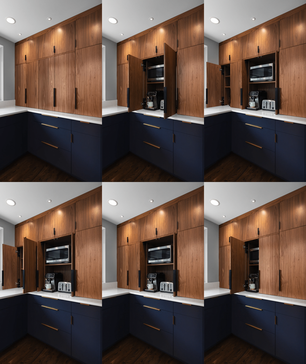
To maximize functionality and maintain a clutter-free kitchen, we crafted a custom solution—two appliance garages. These sleek, space-saving compartments provide convenient access to small appliances when needed. When not in use, they neatly tuck everything away, leaving your countertops clean and uncluttered.
This thoughtful addition not only enhances efficiency but also keeps your kitchen looking effortlessly organized, so you can make the most of your countertop space.
Spectacular Waterfall Edge Countertops
One of the standout features of this kitchen is the use of waterfall edge countertops. Not only are they practical, but they also create a powerful and seamless visual impact. The island, in particular, makes a bold statement and truly displays the beauty of the white quartz material.
The continuous flow of quartz looks stunning while simultaneously enhancing the overall functionality of the island, making it a versatile and stylish focal point in the kitchen.

